Sunday, 15 April 2018

Poster: 1st Draft


We asked our teacher to fill out a response form to investigate what they liked about the poster and what we could improve on next time.

Teacher response:

What our teacher liked:

  • One feature of the poster that my teacher liked is the colour scheme purple. The reason why we chose the colour purple to be our main colour is because it is a unisex colour. Even though our target audience is boys we wanted to use a colour that can be appealing to both genders, so that females may also we intrigued to watch this movie aswell. 
  • Another aspect of the poster that our teacher liked is our title and how it fades, but at the same time it is still bold .  Our group wanted the title to fade in order to have a feature in which it would stand out. It will make the audience question why it is fading-is it linked to the storyline? We used the same font that was used in our trailer to keep consistent, additionally we made sure our title is in capitals as it is typical feature for a film poster.
  • Another thing that our teacher liked about the poster is the background with the math equations. Our group decided to use math questions because it lets the audience understand that this movie is about maths.

What our teacher thought that we can improve on:

Our teacher believed that we are missing some of the conventions of a film poster. An example of this is a tagline, a tagline(also known as slogan) which is a catchy short phrase that sums up the plot, tone, or themes of the film. By adding a tagline we are able to give the audience more insight into what the trailer is about.

Another point that our teacher believed that we can improve on is that we should emphasis the release date at the bottom. As it is just below the poster credentials it blends in with the rest of the writing. To improve our group will add a feature to the release date to make it stand out.

The last point that our teacher said that we needed to improve is that the actors and directors names are not on the poster. There are individuals that worked hard on the trailer and as a result they need to be recognized. To improve our group will put the actors names at the top of the poster.


PERSONAL EVALUATION

I believe that are group did well for our first draft. We tried to make this poster as professional as we could using serif drawing plus. The programs is really good for creating posters however, as it was our first time editing we did not really understand how to use it so we had to ask someone who studied graphic design to show us how to use the program. Nonetheless our group is really happy with the final product. By receiving back the response form from the teacher it allowed us to pintpoint the main areas of improvement, which is helpful.

WWW: one thing that we personally thought that went well was the colour scheme, as it opens the door for both boys and females to come and watch the movie. Event though our main priority was our target audience which are boys between the ages of 15-25 we still wanted to leave the door open for females, who may be interested in watching this movie.

EBI: One thing that we believe that we can improve on is including the names of the actors, directors or producers on the poster.


Colour Wheel

Our group wanted to make sure the colours that we chose for are poster represents our target audience. A very important aspect of a poster is colour, this is because the colour of the poster represents who the movie is targeted towards, for example, if we choose our main colour too be pink it gives the impression that the movie is directed towards females as pink is a feminine colour. If we choose our main colour to be grey it may suggests to the audience that the movie is directed towards the older generation, which is inaccurate as our movie is governed towards the younger generation.

Our group thought that the main colour that would be the most appropriate for our poster is purple or blue. To investigate this asked 30 boys in our sixth form what was there favourite colour out of 7 colours given to them, which included blue, red, pink, orange, purple,black and green.

Here are the results:


The results show that Purple and Blue was the most popular colours whilst orange was the least favourite.  As our survey only holds a small sample our group looked into the faveriote colours around the world. Therefore we can grasp a general idea into what colour is the most popular for males.
According to Live Science (https://www.livescience.com/34105-favorite-colors.html) a survey was conducted on 2,000 men and women. Here are the results:


The most popular colour for males are blue and green, and for females blue and purple. Even though purple is not as popular for males that it is for female there is still quite a high percentage of boys that like the colour purple. As our movie is directed towards males the most likely colours that we would use for the poster is blue, green and purple.

In our primary research the colour purple was voted the most popular colour among boys, however the survey suggests that blue is the most popular colour.After much deliberation our group decided that the main colour that we are going to use is the colour purple and blue. Even though the movie is directed towards males the colours can also target females as blue and purple are also popular colours among females, according to the Live Science survey.

Our group researched colour charts in order to know what colours go with the colour purple


Our group also researched into the colours that go with the colour blue:


WHAT HAVE WE LEARNT?

Through this research our group has learnt what colours we are going to use for our film poster. Additionally, by looking at the different colour schemes it has given our group some insight into what colours we can pair with our main colours of purple and blue to make our poster effective.


Poster Anaylsis: Wonder


Poster Anaylsis: The Iron Lady


Poster Anaylsis: The Queen of Katwe


The Convetions of a Film Poster

Friday, 16 February 2018

MOOD BOARD

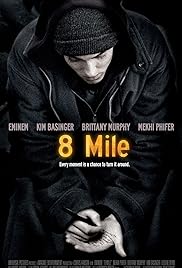
Image result for 8 mileImage result for american assassin

Image result for preciousImage result for sleight movie poster


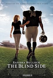
This mood-board includes films that we have looked at for inspiration and not only provides visual of how we might like our film poster to look but also similar plots and ideas that we want to incorporate in our film trailer.


HOW HAS THIS RESEARCH HELPED US?
Even though we have chosen the genre crime drama we still wanted to create a inspirational movie, that will make our audience think into its themes and motives.. By comprising a mood board of inspirational movies our group was able to look into their trailers and posters to see what we could include to make our trailer and poster just as successful.

This mood boards also acts as a reminder of what the aim of our trailer is, which is to entertain but also to inspire.