Showing posts with label RESEARCH AND PLANNING. Show all posts
Showing posts with label RESEARCH AND PLANNING. Show all posts
Wednesday, 9 May 2018

Sunday, 6 May 2018


Sunday, 15 April 2018

Poster Process- Final Draft
The first step in creating our poster is to open Serif DrawPlusX6, as this is the program that we will be using to make our poster.

The second step of creating the poster is to download a picture of numerous math equations and crop it so that it fits to half of the blank page. Then we made the picture transparent so it fades at the top of the page, so that the actors names could be seen at the top.

The next step to making our poster is downloading a picture of purple smoke and crop it so that it can fit the bottom part of the page. We also made this picture transparent so that it can fade at the top.

In our poster we will have the three main characters that is in our poster. The character that we will edit is Mya who is played by Patricia Male. Our group first download a picture of Patricia and removed the background in the cutout studio.

We then colored the picture grey and adjusted it in size so we can position it at the left hand side of the page.we also made the picture transparent at the bottom so that you could not see the border.

We then downloaded a picture of Yazdan and we removed the background in the cutout studio.

We the colored the picture grey, flipped it, adjusted the size and place it in the right side of the page.

We then removed the background of Euan who plays the protagonist in the cutout studio.

We then colored Euan grey and and positioned them so that he was in front of the other to characters so that the audience knows that Euan is the protagonist in the movie and the 2 characters behind Euan are the supporting roles. We also made Euan transparent at the body so that he fades into the smoke. We also added the Actors at the top. As Euan is the main actor his name is left whilst then we put Patricia on right side of the page. We highlighted their last names and adjusted the names so that the names are in line with each other.
We also used the same font that we used for the title in our main trailer. The font is ColdSpaghettiBTN

Then we added the title and slogan using the same font ColdSpaghettiBTN and we also added the movie rating of the trailer at the bottom right hand side of the poster.

We then added the poster credits which include the names of the directors and the actors. We also added our film identity at the bottom of the poster.

We then added a social media link at the bottom of the poster.

The final poster.
Poster: 2nd Draft

Corrections We Have Made
- From our previous evaluation of the first draft our teacher said that we needed to include a tagline to help sum up the themes, ideas and story line of the movie. As a group we came up with different ideas to what the tagline should be here are a few examples:
I think, therefore I am.- we were also considering doing this quotation in capitals. The reason why we liked this tagline is because it is an actual quote from Rene Descartes, in whom the movie is named after. We believe that by using this tagline it will help the poster celebrate the life of an influential mathematician, and also it goes along with the themes of movie.
Another tagline we were considering was 'To be inspirational you first have to inspire yourself.'- Our group liked this tagline because it is a quotation that will make the audience think. Additionally, it tells the audience that the purpose of this movie which is to inspire you and to change their way of thinking.
Ellie and I both liked these taglines but we decided to go with the tagline of 'I think, therefore I am.' The reason why our group decided to use this tagline is because we like how it is an actual quotation from the mathematician Rene Descartes, therefore it fits into the essence of this poster as film is based on the Cameron who is meant to resemble to modern day version of Descartes life.
- Another part of the poster that our teacher thought that we could improve on is to include the actors names. By having the actors names on the poster the audience is able to recognise who they are, so if they have done any previous work which the audience likes they are more likely going to see the movie. Also we have some upcoming actors in this trailer which have not done any previous acting, so the audience will able to keep track them in the future. Therefore having the actors names is also a form of publicity for them. On our poster we included the protagonists name Euan who plays Cameron and supporting actress, Patricia who plays Mya.
- Our teacher also thought that we need to include the BBFC rating for the movie so the audience can see what rating the movie the trailer is aimed at so they can decided if it suitable for them to watc
- h. Therefore our group added the rating in the bottom right of the poster.
Limitations
We asked our teacher to review our poster again to see the corrections that we can make:
- Our teacher believed that the names of the actors needs to be made bold and bigger so that it fills the page.
- Our teacher also thought that we need to change the position of the characters, so she thought that we should make Euan larger and move Patricia and Yazdan upwards to fill the page.
- Additionally Our teacher thought that we need to make the release date stand out because it blends into the poster credits. This needs to be done so that the audience can see clearly when the movie is coming out.
- Our teacher also thought that we need to add the company identities at the bottom of the page.
Personal Evaluations
WWW: With the helpful criticism of our teacher and others our poster is looking more professional. Even though we have a lot of work still to do our group really like the format and the concept of the poster.
EBI: Our group will pay attentions to the criticisms that we have received and apply the corrections.
Poster: 1st Draft

We asked our teacher to fill out a response form to investigate what they liked about the poster and what we could improve on next time.
Teacher response:
What our teacher liked:
- One feature of the poster that my teacher liked is the colour scheme purple. The reason why we chose the colour purple to be our main colour is because it is a unisex colour. Even though our target audience is boys we wanted to use a colour that can be appealing to both genders, so that females may also we intrigued to watch this movie aswell.
- Another aspect of the poster that our teacher liked is our title and how it fades, but at the same time it is still bold . Our group wanted the title to fade in order to have a feature in which it would stand out. It will make the audience question why it is fading-is it linked to the storyline? We used the same font that was used in our trailer to keep consistent, additionally we made sure our title is in capitals as it is typical feature for a film poster.
- Another thing that our teacher liked about the poster is the background with the math equations. Our group decided to use math questions because it lets the audience understand that this movie is about maths.
What our teacher thought that we can improve on:
Our teacher believed that we are missing some of the conventions of a film poster. An example of this is a tagline, a tagline(also known as slogan) which is a catchy short phrase that sums up the plot, tone, or themes of the film. By adding a tagline we are able to give the audience more insight into what the trailer is about.
Another point that our teacher believed that we can improve on is that we should emphasis the release date at the bottom. As it is just below the poster credentials it blends in with the rest of the writing. To improve our group will add a feature to the release date to make it stand out.
The last point that our teacher said that we needed to improve is that the actors and directors names are not on the poster. There are individuals that worked hard on the trailer and as a result they need to be recognized. To improve our group will put the actors names at the top of the poster.
PERSONAL EVALUATION
I believe that are group did well for our first draft. We tried to make this poster as professional as we could using serif drawing plus. The programs is really good for creating posters however, as it was our first time editing we did not really understand how to use it so we had to ask someone who studied graphic design to show us how to use the program. Nonetheless our group is really happy with the final product. By receiving back the response form from the teacher it allowed us to pintpoint the main areas of improvement, which is helpful.
WWW: one thing that we personally thought that went well was the colour scheme, as it opens the door for both boys and females to come and watch the movie. Event though our main priority was our target audience which are boys between the ages of 15-25 we still wanted to leave the door open for females, who may be interested in watching this movie.
EBI: One thing that we believe that we can improve on is including the names of the actors, directors or producers on the poster.
Colour Wheel
Our group wanted to make sure the colours that we chose for are poster represents our target audience. A very important aspect of a poster is colour, this is because the colour of the poster represents who the movie is targeted towards, for example, if we choose our main colour too be pink it gives the impression that the movie is directed towards females as pink is a feminine colour. If we choose our main colour to be grey it may suggests to the audience that the movie is directed towards the older generation, which is inaccurate as our movie is governed towards the younger generation.
Our group thought that the main colour that would be the most appropriate for our poster is purple or blue. To investigate this asked 30 boys in our sixth form what was there favourite colour out of 7 colours given to them, which included blue, red, pink, orange, purple,black and green.
Here are the results:

The results show that Purple and Blue was the most popular colours whilst orange was the least favourite. As our survey only holds a small sample our group looked into the faveriote colours around the world. Therefore we can grasp a general idea into what colour is the most popular for males.
According to Live Science (https://www.livescience.com/34105-favorite-colors.html) a survey was conducted on 2,000 men and women. Here are the results:

The most popular colour for males are blue and green, and for females blue and purple. Even though purple is not as popular for males that it is for female there is still quite a high percentage of boys that like the colour purple. As our movie is directed towards males the most likely colours that we would use for the poster is blue, green and purple.
In our primary research the colour purple was voted the most popular colour among boys, however the survey suggests that blue is the most popular colour.After much deliberation our group decided that the main colour that we are going to use is the colour purple and blue. Even though the movie is directed towards males the colours can also target females as blue and purple are also popular colours among females, according to the Live Science survey.
Our group researched colour charts in order to know what colours go with the colour purple

Our group also researched into the colours that go with the colour blue:

Our group thought that the main colour that would be the most appropriate for our poster is purple or blue. To investigate this asked 30 boys in our sixth form what was there favourite colour out of 7 colours given to them, which included blue, red, pink, orange, purple,black and green.
Here are the results:

The results show that Purple and Blue was the most popular colours whilst orange was the least favourite. As our survey only holds a small sample our group looked into the faveriote colours around the world. Therefore we can grasp a general idea into what colour is the most popular for males.
According to Live Science (https://www.livescience.com/34105-favorite-colors.html) a survey was conducted on 2,000 men and women. Here are the results:

The most popular colour for males are blue and green, and for females blue and purple. Even though purple is not as popular for males that it is for female there is still quite a high percentage of boys that like the colour purple. As our movie is directed towards males the most likely colours that we would use for the poster is blue, green and purple.
In our primary research the colour purple was voted the most popular colour among boys, however the survey suggests that blue is the most popular colour.After much deliberation our group decided that the main colour that we are going to use is the colour purple and blue. Even though the movie is directed towards males the colours can also target females as blue and purple are also popular colours among females, according to the Live Science survey.
Our group researched colour charts in order to know what colours go with the colour purple


WHAT HAVE WE LEARNT?
Through this research our group has learnt what colours we are going to use for our film poster. Additionally, by looking at the different colour schemes it has given our group some insight into what colours we can pair with our main colours of purple and blue to make our poster effective.


Friday, 16 February 2018
MOOD BOARD
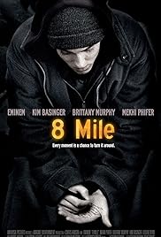


This mood-board includes films that we have looked at for inspiration and not only provides visual of how we might like our film poster to look but also similar plots and ideas that we want to incorporate in our film trailer.
HOW HAS THIS RESEARCH HELPED US?
Even though we have chosen the genre crime drama we still wanted to create a inspirational movie, that will make our audience think into its themes and motives.. By comprising a mood board of inspirational movies our group was able to look into their trailers and posters to see what we could include to make our trailer and poster just as successful.
This mood boards also acts as a reminder of what the aim of our trailer is, which is to entertain but also to inspire.
Tuesday, 9 January 2018
Modern Descartes Trailer- 2nd Draft
From the feedback that we received from our first draft our group tried to focus on the most frequent points that came up on the what we can improve list. These points included:
- Incompleteness of the trailer
- Title and Release date
- Sound
- Fluidity of shots
In our last trailer we did not include a title our release date. So in our second draft we made sure to included the title of the production. However instead of putting a release date our group put 'COMING SOON' however, later on whilst discussing the further plans for the trailer our group decided that by putting an actual date it would be more professional. As we already have put the date on the poster as May 15 so this is the date that we will use on the trailer.
Our group went through the trailer and took note at the shots that were not fluid so we tried to edit the shots that there would be fluidity. However upon loading the trailer I found that there are more shots that we have to edit in order to have a fluid motion.
We gave our class and teacher another response form, so they can give us helpful criticism in order to create the best trailer that er possibly can:

What do we have to improve?
- The first point that our teacher said that we have to improve is sound. When we asked if she could expand she told us that the sound grainy towards the end of the trailer, this included the soundtrack and the voice overs. This may because in the last trailer we could not really hear the voiceovers so our group increased the decibels of the voiceovers and the soundtrack. To improve on this our group will reduce the decibels so that the music and voiceovers do not sound grainy.
- The next point that we have to improve is the 2nd film company identity. This point came up previously on the response forms that we received back on the first draft. The reason why our group has not improved this feature is because we have been on schools holidays so our group has not been able to access the program that we used to create the identity at home because the program only exists on the schools computer. So when school vacation is over our group will improve the film identity on the school computer then add it to our trailer.
- The next point that our teacher said that we need to improve on is fluidity of shots. In the response forms that we received back on our first draft, one of the most frequent points of things that we needed to improve was fluidity of shots. So our group sat down and reviewed all the shots that were not fluid. We used serif as the program to edit our trailer and it is a bit slow and jumps a lot so it was hard to distinguish which shots were not fluid and what shots jumped because of the system. Now we know the shots that are not fluid our group will edit them.
- Our teacher said that we needed an actual release date rather than coming soon as it is more professional to have a date. To improve our group will use the date May 15.
- The last point of improvement is cutting the music so it fits the trailer as trailer finishes and the music continues. To improve our group will cut the music.
Student Response:

Our classmate has the same points of improvement as our teacher, so we are going to list what he liked about the trailer:
- Our classmate liked how we changed the beginning of the trailer. The reason why our group changed the beginning of the trailer is because we thought that it will be more suitable as we wanted to slow down the pace of the beginning. When we slowed down the pace with the old opening scene it looked grainy so we thought that it would be more suitable to change the shot
- Another point that are classmate liked is the song selection.. As a group we decided that it would be more suitable to choose a different song. The reason for this is because the previous sound was too, so deliberation we thought that the new song was had a good beat but was still uplifting.
What have I learnt?
Through this feedback we are able to realise what we have to change to make our trailer successful. We find the feedback forms useful as they allow us to understand how another perspective when critiquing our trailer.
Friday, 5 January 2018
Response to First Draft
After completing the first draft and looking back over the response forms from the rest of the class our group has realized that there are 4 main points of improvements that seems to appear on majority of response forms. That is sound, fluidity of shots, the incompleteness of the trailer is and also the title and release date.
Even though I believe that are group did a good first draft there is still a lot of improvements that we have to make in order to reach our final goal of having a successful trailer.
The three main points that we will be focus on for our 2nd draft. This is Fluidity of shots, incompleteness and title and date release.
The reason why we are not focusing on sound as much is because at the moment the school has been dismissed for school holidays therefore it is hard to get individuals for sound so we have to wait till we are back at school to record them.
Even though we have to improve on these points there are features of our trailer that I really do like. One of these features is the format and sequence of the shots, it makes our product look like a trailer rather than a film opening sequence which is important.
One thing that i personally disliked about the trailer is that we have not finished and included the common features of a trailer such as BBFC rating and release date. This is will the main focus in our second draft, that we include all the common features of a trailer so that we can create a successful trailer.
WHAT HAVE I LEARNT?
This personal evaluation of our first draft has allowed me to understand what I personally feel about the trailer and allowed me to come up with some ideas that will enhance the performance of the trailer.
Modern Descartes Trailer- 1st Draft
Our First Draft:
To know what to improve our group gave a response form to our class and teacher to fill out, so that we will be able to understand the perspective of others when viewing our trailer and gain constructive criticism in order to create a successful trailer.
Here is an example of one of the response form that we received back:

Our response to student feedback:
Our response to teacher feedback:

To know what to improve our group gave a response form to our class and teacher to fill out, so that we will be able to understand the perspective of others when viewing our trailer and gain constructive criticism in order to create a successful trailer.
Here is an example of one of the response form that we received back:

Our response to student feedback:
- Emily stated that the trailer seemed incomplete. This is true due to that when we were filming we were using someones iPhone and as a result we were not able to get the footage from the phone and edit it before the deadline for the first draft. To improve in our second draft we will makesure that the footage is complete.
- Another criticism that we received is that our trailer has no title or date of release. This is very important as the audience wont know the name or when the movie is coming out which is bad marketing. The reason why we had not done this is because our group was not sure on the font and design that we should do for our trailer so we did a questionnaire to find out what other people thought. We did our first draft before we did the questionnaire. As a result we did not know what we wanted to do foe the title. However, our group does recognize that we should at least included the title.
- Emily stated that one thing that we could improve is the sound. The reason why our sound is irregular and not fluid is because many of the shots that we had filmed had a lot of background noise, so we had to mute the shot and dub sound over the shot. Our group has not completed the sound yet as we are still figuring out the sequence of shots and moving things around. Once this is completed we will start on the sound.
- On the response form Emily said that one thing that we can improve on is the fluidity of the shots as some scene cutty. I wanted to know more so I asked if she could stay back so i can ask some questions and she said that at the beginning of the trailer with the graveyard scene she thought that the shots were to fast and too sharp they were not fluid also she said because it is a sad moment we need to slow the pace down. To improve we will go over that specific part in the trailer and use some animation techniques in order to slow down the pace of the trailer.

- Our teacher had the same outlook as Emily on our trailer as she she said that the trailer was incomplete, there is not title, or release date. She also said that the sound was not good and that we need some voice overs to complete the trailer.
- Another criticism that we received is that in the shot were the protagonist is being chased we here someone speak but it is cut short. To improve on this our group is going to extend that particular shot so that we can hear everything that they are saying.
- Another thing that the teacher said that we need to improve on is our second identity. When on full screen we can see when the images are cut cropped correctly and as a result you can see a shadow. To improve this I will crop the images correctly so our film company identity does not give of a shadow.
Thursday, 4 January 2018
Editing
Before starting filming I went back and had a look back on my research and planning into conventions of a film trailer to truly understand what to include when editing our film trailer. This previous research helped me to recognize what I need to include to create a effective trailer.
FILM PRODUCTION LOGOS
When analyzing other trailer I came to the understanding that film production logos came at the very beginning of the trailer before we see any footage. However when I researched further I found that some trailers allow the audience to see some of the trailer before the production identities in order to set the tone for the trailer. An example: If you watch the beginning of the Queen of Katwe trailer you can find that the first thing that the audience is introduced to is an inspirational quote setting the tone fore the rest of the trailer. It shows that the audience that the purpose of this trailer is to inspire them . The audience is also introduced to the setting and the protagonist before we see the film production identities.
I really like how the beginning of this trailer is formatted therefore I thought that I can apply some these concepts to my own trailer. In my own trailer I made sure that the audience is introduced to the Protagonist and his sisters situation, letting the audience know that their parents have died before we see the film production identities. By doing this it sets the tone for the rest of the trailer allowing the audience to sympathies with the protagonist. I also used a cross fade animation technique in the opening scenes to slow down the pace of the trailer and allow the audience to contemplate the circumstance of the protagonist and one of the reasons why he went into selling drugs. The opening scene will only last for 14 seconds then we will see the film company identities. Furthermore by placing the company identities after meeting the protagonist it gives the audience the impression that the beginning part of the trailer is more like the prequel to the actual trailer,as you are gaining knowledge into the protagonists past and not the actual story line. Then by introducing the film company identities it shows the audience that the story line of the trailer is now beginning.

FILM TITLE
In all the trailers that I have seen the film title always comes at the end of the Film Trailer. So in our film trailer we placed the film title at the end. However, we wanted to make sure that the design for the film title fit the personality of the trailer therefore we did a questionnaire and found that majority of the group liked the design format of Cold Spaghetti BTN Therefore we decided to use this font, as the design fits in with the themes in the trailer, and because it was chosen by the majority. Our group liked the font as we believed that the rough rugged writing reflects the hard life of the protagonist, and the title looks handwritten which makes it more personal to the audience. We decided to do the colour white on a black background as it will standout more and grab the attention of the audience, but at the same time due to the simplistic colours it is not brash and too loud which our group wanted.
MUSIC
My co-director Ellie D'Sylva was in charge with selecting the track for the trailer. However, when applying the track to the trailer I found that the track is not long enough for the whole trailer so I have to double the music so it can last till the end of the trailer. The music is a dramatic beat which emphasises the dramatic situation of the protagonist. The music starts 5 seconds into the trailer after the quote in order for the audience to reflect the quote and make them think how this quote might apply to our trailer.
Additionally, in certain shots we had to mute the shot and dub sound over it. The reason why we had to do this is because when we filmed the shot and played it back there was a lot of background noise, so to deal with this situation we decided to mute the shots that have loud background noises. So the actors that were in that particular shot would sit down with me and we would both look at the screen and he would say their line so they are in time to when they say it on the screen. I would record their voice on a separate device such as a phone and add it on top of the shot.
TIME LENGTH
The average time length for a film trailer is 1.30-2.00 minutes. This is why I tried to edit the trailer so it stays between these boundaries. This aspect of editing is what I found the most difficult, as I was struggling to condense the trailer below 2 minutes. When I began editing it started to look like a film opening rather than a trailer, so to help me I looked into our past research into the codes and conventions of a trailer and applied the concepts to our trailer therefore it made it easier to edit. When editing the trailer I cut lots of the shots that we have filmed in order to reduce the time length. We also positioned the cuts so that they were in order but in a way that it does not give away too much of the storyline in order to introduce enigma codes which will entice the audience to come and see the trailer.
WRITTEN SLIDES
In the editing process I thought that it will be beneficial to add some written slides to the trailers as they seem to be a common feature. I was not sure what to add so I added the basic captions such as based on a true story and critic reviews. By doing this it makes the trailer more authentic.
WHAT WENT WELL
The main thing that went well with filming is that in year 12 I was not given the opportunity to edit before to edit our opening sequence because we appointed the duty to my co-worker. So this is my first time editing so I think that through the experience of editing it has helped me develop as a designer and creator.
Furthermore through editing it has allowed me to have a better understanding into how to edit the movie poster and magazine. Even though we would use different programs as this is a video and they are images, this experience has allowed me to understand the basic principles of the process to completing the final product.
Music
Music is a very important of a feature of a trailer, as it changes the atmosphere of the trailer and how individuals perceive our media text. As a result our group wanted to pay close attention to the music and make sure that it is appealing to our target audience and that they can identify with the music. To make sure that our group picked the right song we conducted a survey on 30 boys who are the same age as our target audience. We asked them what was there favourite genre of music out of pop, rock, hip hop, indie and R&B. Here are the results.


Hip hop was the most popular genre of music, therefore our group tried to find songs that would fits the genre of hip hop. We narrowed it down into two songs.
WWW: Our group really liked this song because because of the lyrics, the lyrics portray a man trying to find his way out, and is looking for a light. This is just like the protagonist who is trying to find a way out of the situation that he is in, and to provide for his family. Additionally the song has a very good beat and it is easy to edit the trailer so it matches the timing of the song.
EBI: A limitation of this song is that when we tested it on some footage it keeps jumping and skipping,this makes the trailer seem patchy and not fluid.
WWW: The main thing that our group liked about this song is that the beat to this song is phenomenal. We really believe that it captures the protagonists life, this is because the tone of this song is harsh so it reflects the harsh situations that the protagonist is ging through.
EBI: A limitation of this song is that it has no lyrics, as a result our group believes that it is not as effective than the other song.
Consequently our group decided to use the song 'Lights On' however if the song continues to keep jumping we will use the song 'Get Lost.'
Nonetheless our group believes that both of this songs reflect our target audience as the younger generation is more likely appreciative towards the style of hip hop, which will make them more engaged in the trailer, therefore they are more likely going to watch the movie.
Subscribe to:
Posts (Atom)
-
 Locations Box Park Address: 99 George St, London CR0 1LD Pros: The strengths of filming at this location is that it is...
-
 We Start with a Blank Screen. We then Have the words 'NEON' positioned in the center of the screen. We than alternate ...